 FrontendHalt
Aggregate on trusted infrastructure
The browser requests bounded, authorization-filtered series; warehouses and query services perform scans, joins, and rollups.
FRONTEND SYSTEM DESIGN
Design a dashboard rendering large, filterable time-series and aggregate data without freezing the UI.
THE INTERVIEW SEQUENCE
Clarify scope
Set requirements
Draw data flow
Defend trade-offs
Start with the smallest coherent design. After the main path works, introduce failure, scale, accessibility, observability, and release strategy one constraint at a time.
Billions of source events are aggregated before reaching the browser; the UI never scans raw event history.
A dashboard contains 6-20 independently refreshable widgets over a selectable time range.
Interactive filters should respond within 100 ms locally and common server queries within 2 seconds at p95.
Freshness is explicit: live operational views may lag seconds while business reports may lag hours.
The browser requests bounded, authorization-filtered series; warehouses and query services perform scans, joins, and rollups.
Validated dimensions, filters, range, and timezone create shareable views while private values remain outside the URL.
Equivalent queries share results, stale responses cannot overwrite newer selections, and each widget can retry independently.
A worker can normalize large series, but aggregation and downsampling belong on the server when payload size is the bottleneck.
The request makes range, grain, timezone, dimensions, and server-enforced limits explicit.
type DashboardQuery = { metric: string; from: string; to: string; grain: 'minute' | 'hour' | 'day'; timezone: string; filters: Record<string, string[]>; dimensions: string[] };type SeriesResponse = { generatedAt: string; partial: boolean; series: { key: string; points: [number, number | null][] }[] };Impact: Charts show data for a previous filter.
Mitigation: Abort superseded requests and only commit a response matching the current canonical query key.
Impact: A whole dashboard becomes unusable.
Mitigation: Keep widget error and retry boundaries independent while retaining the last successful value with a stale label.
Impact: Payload, memory, and rendering work explode.
Mitigation: Enforce server limits, aggregate an Other bucket, downsample, and explain truncated results.
Impact: Buckets and totals disagree around midnight or DST.
Mitigation: Send an IANA timezone, let one layer own bucketing, and test DST and partial-period cases.
Drive the discussion yourself first. This is one strong answer delivered the way you would say it in the room — a model, not the only correct design.
The one thing to lead with: the browser should receive pre-aggregated numbers, not raw rows. Once you have said that, the rest of the answer is about making the dashboard feel responsive while several slow queries run — independent widgets, filter state in the URL, and any heavy client work pushed off the main thread.
Step 1 · Clarify
Ask: 'How big is the underlying data — thousands of rows, or billions of events? How many widgets on a dashboard? Real-time or is a few minutes stale acceptable? And do users build their own dashboards or use fixed ones?' Assumptions: 'Very large event data, roughly 8 to 12 widgets per dashboard, a few minutes of staleness is fine, and users pick from fixed dashboards with adjustable filters.' The data-size answer is the whole design.
Step 2 · Requirements
User-facing: pick a date range and filters, see charts and totals, drill in, and export. It must stay usable while data loads. Hidden: never freeze the UI, one slow query must not block the rest of the page, and a given view must be shareable as a link.
Step 3 · Aggregate on the server, not the client
'For anything beyond a small dataset, the client gets pre-aggregated series — daily totals, top-10 breakdowns — computed by the query layer or a data warehouse. Sending raw rows to the browser leaks data, wastes bandwidth, and asks a phone to do a database's job. This is the single most important decision.'
Step 4 · Independent widgets
'Each widget fetches and renders on its own. It shows a skeleton until its own query returns, and it has its own loading, error, and retry state. So if the revenue-by-region query is slow, the other five widgets still appear. The dashboard shell only owns the shared filter state.'
Step 5 · Filter state lives in the URL
'The date range and filters are serialized into the URL query string. That makes any view a shareable, bookmarkable link and makes it survive a refresh. On load, the dashboard reads the filters from the URL and requests each widget's data with them applied. Changing a filter updates the URL and triggers the affected widgets to refetch, each showing its own loading state rather than blanking the whole page.'
Step 6 · Keep the main thread free
'If any real computation remains on the client — say, a rollup the API cannot do — it goes in a Web Worker so scrolling and interaction do not stutter. And I canonicalize each query and drop responses whose key no longer matches the current filters, so a slow old response cannot overwrite fresh data.'
Step 7 · Rendering and accessibility
'SVG charts up to a modest number of marks because they are semantic and easy to make keyboard-inspectable; canvas only for dense charts, and then with a separate accessible data table. Every chart gets a title, a short text summary, and a table view, and series are never distinguished by color alone.'
How to close
'So: huge event data, fixed dashboards with filters, minutes of staleness acceptable. The server sends pre-aggregated series, never raw rows. Each widget fetches and fails independently behind a skeleton. Shared filter state lives in the URL so views are shareable and survive refresh. Any leftover heavy client work goes to a Worker, and stale responses are dropped by query key. First metric after launch: end-to-end query latency and correctness, then payload size and partial-failure rate.'
It leaks data and shifts expensive scans, transfer, and aggregation onto an untrusted, resource-limited client.
DESIGN CHECKLIST
Use this checklist to rehearse the case without reading the worked answer above.
Do not design yet. Use these questions to make hidden assumptions explicit and prevent solving the wrong problem.
What data volume per chart — thousands of points, or millions requiring server-side aggregation?
Real-time updating dashboards, or point-in-time reports refreshed on demand?
How many charts/widgets render simultaneously on one dashboard?
Do users need to export or drill down into raw underlying data?
These are the user-visible capabilities the design must support. They define the first version's scope.
Render multiple charts/widgets on one dashboard, each independently filterable by a shared date range and dimension filters.
Support drilling from an aggregate chart into more granular underlying data.
Let users save and share a specific dashboard configuration (filters, layout).
Export the current view's data.
These qualities shape the architecture even though users do not click them directly: latency, resilience, accessibility, consistency, and scale.
The UI must stay responsive while large datasets load or re-aggregate — no frozen main thread during a filter change.
Charts should degrade gracefully (skeletons, partial render) rather than blocking the whole dashboard on the slowest widget.
Shared dashboard links must reproduce the exact same filtered view for another viewer.
Now assign responsibilities to clear boundaries. Each part should have one reason to change and an explicit contract with the next part.
Server/edge-side aggregation for large datasets — the client should generally receive pre-aggregated series, not raw rows, for anything beyond a small dataset.
Each widget fetches and renders independently, so one slow query doesn't block the rest of the dashboard from appearing.
Shared filter state lives at the dashboard level and is serialized into the URL, making a given view linkable and reproducible.
Expensive client-side computation (if any remains) is offloaded to a Web Worker so it doesn't block scrolling or interaction on the main thread.
Trace one important user action from input to rendered result. This exposes ownership, race conditions, retries, and stale-data paths.
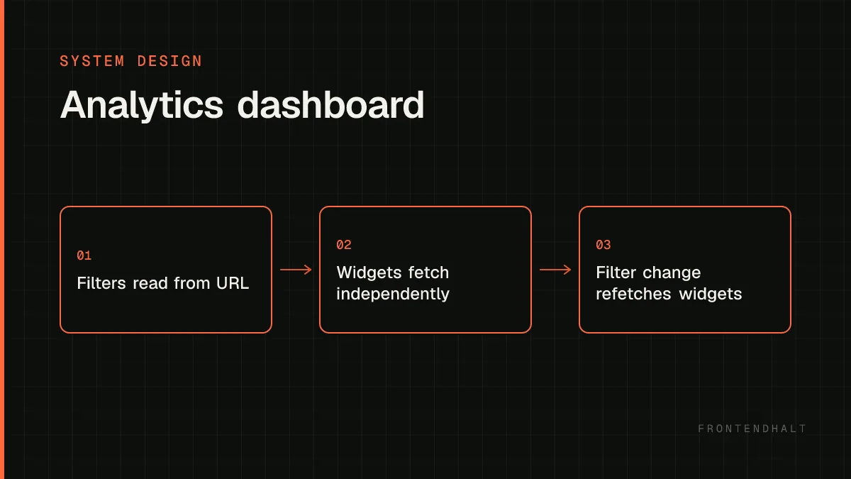
The dashboard reads filter state from the URL on load and requests each widget's data with those filters applied.
Each widget independently fetches its aggregated series, rendering a skeleton until its own request resolves, decoupled from sibling widgets.
Changing a shared filter updates the URL and triggers all affected widgets to refetch, each showing its own loading state rather than blanking the whole page.
There is no perfect architecture. State what each choice optimizes, what it costs, and the signal that would make you revisit it.
Pre-aggregating on the server reduces client compute and payload size dramatically but limits ad hoc client-side re-slicing; a raw-data export path can cover that gap without forcing every view to ship raw rows.
Independent per-widget fetching improves perceived load time (fast widgets appear immediately) at the cost of more total requests than one combined dashboard payload.
Serializing filters into the URL enables sharing/bookmarking at the cost of URL length and needing careful encoding for complex filter shapes.
Scale the measured bottleneck rather than every box. Frontend scaling includes payload size, main-thread time, rendering work, cacheability, and release safety.
Cache common aggregate queries (e.g. 'last 7 days, no filters') at the API/edge layer since many users will request the same default view.
Debounce filter-driven refetches so rapid filter changes (e.g. dragging a date range) don't fire a request per intermediate value.
Paginate or virtualize any underlying data table associated with a chart drill-down.
Interviewers often probe these failure modes. Name them before being prompted and explain the guardrail you would add.
Shipping raw, unaggregated rows to the client and aggregating in the browser, which falls over as data volume grows.
Blocking the entire dashboard's render on the single slowest widget's query instead of loading widgets independently.
Losing a user's exact filtered view because it lived only in component state, not a shareable URL.
Your closing summary
Restate the critical user flow, the most important quality target, the architecture boundary that protects it, and the trade-off you accepted. Then name the first metric you would watch after launch.
Back to all cases →